
Graphics Are Political Too
 (2 votes, average: 5.00 out of 5)
On Tuesday, January 4th, over twenty members of Meem and the Bekhsoos team attended a session on graphics put together by Lynn, one of our graphic designers.
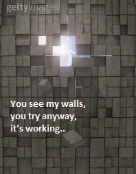
The session focused on anchoring the visual language of Bekhsoos within the larger framework of politics that the magazine seeks to express through articles, statements, features, and columns every week. The purpose of designing graphics for the magazine is not as much decorative or aesthetic as it is political.

One strong example of this was the special issue on gay tourism, sparked by IGLTA’s symposium in Beirut last October 2010. Here – and especially with the logo/banner that was altered especially for this issue – Lynn’s intention was to show a clash of rather orientalist images (camel, tent, exotic woman in veil, lanterns) used sarcastically, thus subversively, to distinguish the many realities of the situation in Lebanon in opposition to simplistic images promoted for tourism. The graphics of the issue included a play on the camel imagery, “ceci nest pas un chameau” (this is not a camel) with a subtle incorporation of Margritte’s famous “ceci n’est pas use pipe.”

Another example was Naji el-Ali’s popular Handallah comic of a little boy turning his back to the world as long as Palestine wasn’t free. Remodeled and used as a graphic for Ghoulama’s article, the boy stood with his back to the world, writing what is actually a powerful line from the article it accompanied, “as if supporters of Palestine couldn’t be queer or transgender” [translated from Arabic]. This image resonated with many, who posted it as their profile picture on Facebook and shared it across many social networks. With minimal design intervention, the image was able to connect a multitude of struggles, visually.

The talk later moved to discussing the power of symbols, as well as cliché and demeaning imagery. The rainbow, for instance, is an over-used symbol that has become an international consumerist logo over the years. Lynn strongly suggested avoiding its use unless directly relevant or necessary (as in the question that directly asked what people think of the rainbow flag itself). Even when using this too-familiar sign, one can always give it a creative twist, at the very least trying to use a unique photo. The concept is analogous to employing overused and cheesy metaphors in written poetry.
This point was explored while giving the example of a poster overloaded with symbolic images of the Palestinian struggle (typical olive tree, typical wall, typical flag, typical kuffiyi pattern) and a figure filled with a pixelated rainbow flag. The poster was essentially crowded even before the text was added, and had repetitive symbol-use for Palestine and two symbols for “gay liberation”. The question was: when does it become too much? Subtlety as power was demonstrated in an alternative poster created for the same event.
The talk was concluded with a reminder to consider Bekhsoos’ graphics as a complementary and integral vehicle that conveys the politics that the magazine expresses every week. Attendees were encouraged to have a go at graphics themselves, with an invitation for a couple of those to be published next issues.
Contributed by Team, based on Helena’s notes.


Leave a Reply